Branding
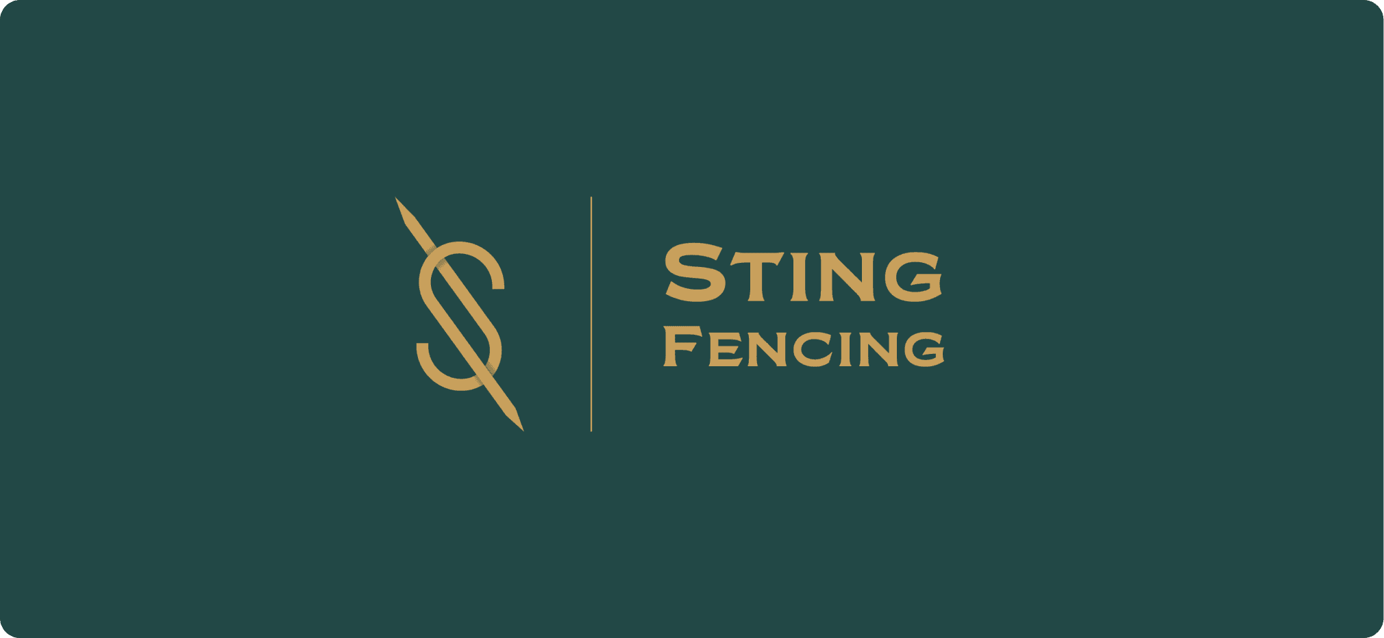
Sting Fencing – Branding & Identity Design
Developed a dynamic and cohesive corporate identity for Sting Fencing, including a custom wordmark, logo system, color palette, stationery, and merchandise mockups. Focused on combining athletic energy with a sleek, modern aesthetic.
Year :
2023
Industry :
Fencing Industries
Client :
Sting Fencing
Project Duration :
3 months
Problem :
Sting Fencing needed a brand identity that conveyed strength, precision, and competitiveness—yet remained professional and versatile across merchandise, marketing, and club signage. The challenge was forging an identity that stood out in the sporting and athletic branding space.
Solution :
I created a bold visual system centered around a custom “Sting” wordmark inspired by a fencing blade and the shape of a sting. A stylized bee/wasp mascot logo with sharp lines was paired with a complementary color palette of green, yellow, and gold for energy and vibrancy.
Key deliverables:
Wordmark and mascot symbol design
Brand color palette (inspired by sport heritage tones)
Typography and iconography consistent across touchpoints
Stationery: business cards, letterhead, envelope
Merchandise mockups: jerseys, stickers, caps, team apparel
Challenge :
Designing a flexible identity system that works across small scale items like badges and large signage was a critical challenge. The brand needed to translate seamlessly into physical forms (uniforms, club banners) while maintaining consistency on digital platforms.
Summary :
Summary :
More Projects
Branding
Sting Fencing – Branding & Identity Design
Developed a dynamic and cohesive corporate identity for Sting Fencing, including a custom wordmark, logo system, color palette, stationery, and merchandise mockups. Focused on combining athletic energy with a sleek, modern aesthetic.
Year :
2023
Industry :
Fencing Industries
Client :
Sting Fencing
Project Duration :
3 months
Problem :
Sting Fencing needed a brand identity that conveyed strength, precision, and competitiveness—yet remained professional and versatile across merchandise, marketing, and club signage. The challenge was forging an identity that stood out in the sporting and athletic branding space.
Solution :
I created a bold visual system centered around a custom “Sting” wordmark inspired by a fencing blade and the shape of a sting. A stylized bee/wasp mascot logo with sharp lines was paired with a complementary color palette of green, yellow, and gold for energy and vibrancy.
Key deliverables:
Wordmark and mascot symbol design
Brand color palette (inspired by sport heritage tones)
Typography and iconography consistent across touchpoints
Stationery: business cards, letterhead, envelope
Merchandise mockups: jerseys, stickers, caps, team apparel
Challenge :
Designing a flexible identity system that works across small scale items like badges and large signage was a critical challenge. The brand needed to translate seamlessly into physical forms (uniforms, club banners) while maintaining consistency on digital platforms.